
UX Case Study
Real Work
Increasing New User Retention by Improving Usability for SmartDollar
🔥 Results
31%
Increase in clicks on all tasks
25%
Decrease in bounce rate

Here are a few final screens. Each user gets a personalized path and clear steps.
Retaining users is one of the highest value things a product does for a business. I believe that in order to retain users well, a product must have solid usability. Usability is significantly more important than a stunning interface (looking at you craigslist).
Retention was not our original objective with this work, but we saw retention increase when we fixed usability issues. Serve users well, and they're more likely to stick around.
Start with the Business Goals
SmartDollar is a b2b (business to business) employee financial wellness product. The user is not the purchaser. The business was broadly interested in increasing user engagement with the product. Better user engagement produces better results to report to the company representative, or client. The better engagement we show the client, the more likely they are to renew (💰💰💰).

Product teams do not typically impact business outcomes directly. We impact business outcomes by impacting product outcomes that we can actually move. If we could fix issues around user engagement, the business outcome should follow.
I Got To Know My Users
As a product designer, a big part of my job is to advocate for the end user. They are getting this benefit for free, so they often come in to SmartDollar unmotivated. It's kind of like when someone buys you a book they love. You'll get around to it eventually.
My product manager and I began interviewing users to better understand the most common problems they face. Through this process, we utilize a couple of guiding frameworks: The Mom Test, The Ladder of Evidence, and Insights to Opportunities.
🤰
The Mom Test → People will unintentionally lie to you about your product. This nifty book teaches you how to ask the right questions and avoid bias.
🪜
The Ladder of Evidence → The most trustworthy user feedback is to actually watch someone use your product. The weakest evidence is to ask them about the future. Learn more here.
🔦
Insights to Opportunities → I don't rely on our users to give us solutions. I observe what they do and say, then translate those things to opportunities.
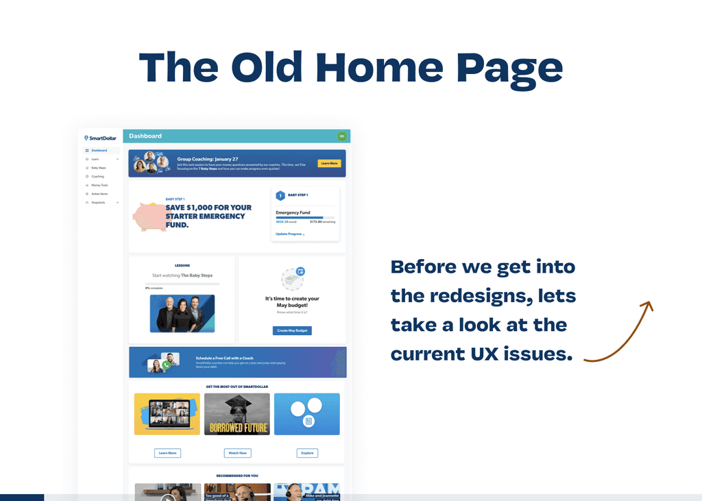
We found out that there was a big user problem around clarity. Users didn’t know what to do next. There seemed to be a lot of features, but there was no guidance. Oof.
We had our user problem: I don’t know what to do first, I don’t know what to do next.
It's Time for a UX Audit
Whenever I start work on a new-to-me product, I like to do a UX audit (super fun name, right?). I'm looking for low risk fixes. In other words, there is research backing up usability standards that must be met. This makes it easy to justify engineering time.
Whenever I run into these issues, I keep a running list. I call this UX debt. If an issue is pressing enough, I will advocate for the team to fix it. If its low urgency, I try to slip it in later on. SmartDollar has a consistent habit of paying off tech debt, but UX debt is just as crippling.
Test Multiple Ideas with Real Users
We ideated as a team and I put together a few prototypes to put in front of users. Here is a very brief summary of my prototyping and testing process:


I learned alot about this particular solution by talking to real people. I was confident in a design solution that solved the problem of I don't know what to do first or next. The next problem that began to crop up was around the big picture.
The next problem that began to crop up was around the big picture. As it turns out, it's ok to solve one problem at a time. We took note of these findings and pressed on.
The Power of Surveys
During this research effort we also ran a survey. What else was confusing about our product? Surveys are a great way to understand if what you hear from a few users is true for a larger sample size.
If you feel like digging into the weeds of our survey results, check out my notion page on those results here.
Our Split Test Results
We ran a split test on the dashboard. A guided homepage experience versus an unguided one. The guided homepage won by a large margin 🎉🎉🎉.

Don’t Gather Data that You Don’t Use To Improve the Users’ Experience
Remember UX debt? Well, one glaring issue was our onboarding experience:
User's were bombarded with 20+ personal money questions right out of the gate. As a general rule, you shouldn't ask the user for data if you don't use that information to benefit the user.
We ended up moving this lengthy survey to a task later on called Personalize Your Experience. Now, users are able to use parts of SmartDollar before putting in personal information. Also, once they finish answering questions, they receive something of value (their next financial Baby Step 👟).
Scaling This Work Up
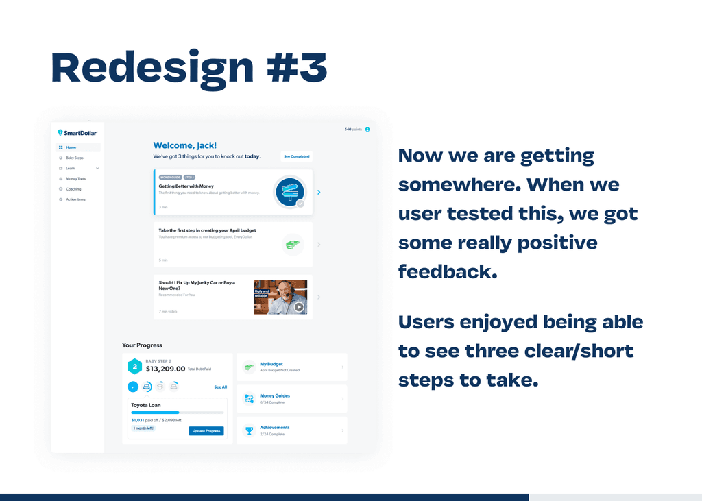
In an effort to ship faster, we decided to scale up a simple version of the guided dashboard. We knew that the big picture was a vital part of this, but one that we could iterate into later. Check out the changes below!

We usability tested this solution with users on video calls as well as unmoderated testing through usertesting.com. Overall, it was a clear usability improvement. User's knew what to do first and next.

The basic design for the dashboard is shown above. Checkmark are awarded when a user completes a task. The next task would become the primary action to take. The dashed line gives a map-like feel to guide the user to an end point.
Communicating the Learnings
Through user interviews, we learned that users want more personalized & shorter content. Unfortunately, that solution was out of scope for the first iteration. We had evidence that guiding the user would improve retention even without personalized/shorter content.
We always bring those bonus learnings to stakeholders. As a designer, my job is to translate user insights to stakeholders.
Data Improvements After Shipping This Work
Improvements to the user experience don’t mean much unless they move product outcomes. Weekly Active Users has been up consistently since we shipped this. In some cases, week four retention of new users was double what it was the previous two years.
I believe this is a signal to continue investing in this idea. The first iteration is never the final version.
Long Term Impact
Usability improvements have a compounding positive impact. Our team was given a new goal to hit related to brand new users interacting with a specific feature.
We made a few tiny changes and hit our goal right away! Since the dashboard experience was so clear, we were able to guide new users in the right direction instantly.
If you have a chance to improve the usability of your product, do it! Serving your customers with honesty and clarity will often have an outsized impact on retention and engagement.
To Wrap It Up
→
We moved a product outcome by improving usability. The unguided dashboard was not serving the user well. We made it guided and saw retention increase.
→
You will learn so much by talking to real users. Be sure to communicate these bonus learnings to your stakeholders frequently (even if they don’t impact the current objective).
→
Create a growing list of UX debt. Keep these things top-of-mind and add to the list as you find UX issues.

Original UX case study researched, written, designed, and built by me, Jack Hawkins.
