UX Case Study
🏝️
Hypothetical Work
Fujifilm App Experience Redesign
They say the best camera is the one you have on you.
I’m one of those old souls that enjoys a nice analog camera experience. I especially love Fujifilm because of the quality of images that it produces while still maintaining the character of film photography.

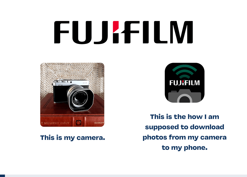
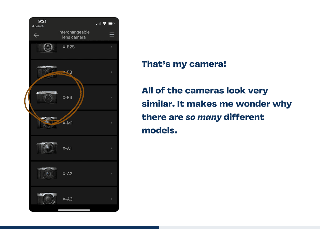
That's my camera, the XE-4 👆
Before my time, people had to wait a long time to see what their photos, now we expect our photos to be instantly viewable and shareable.
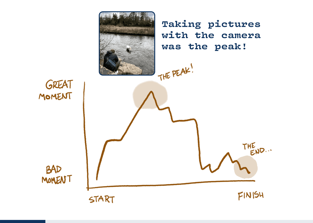
My wife and I were heading to England on a trip and I was very excited to put my new camera to use. Shooting this camera felt great. I took pictures of every Hogwarts-looking building I could find.
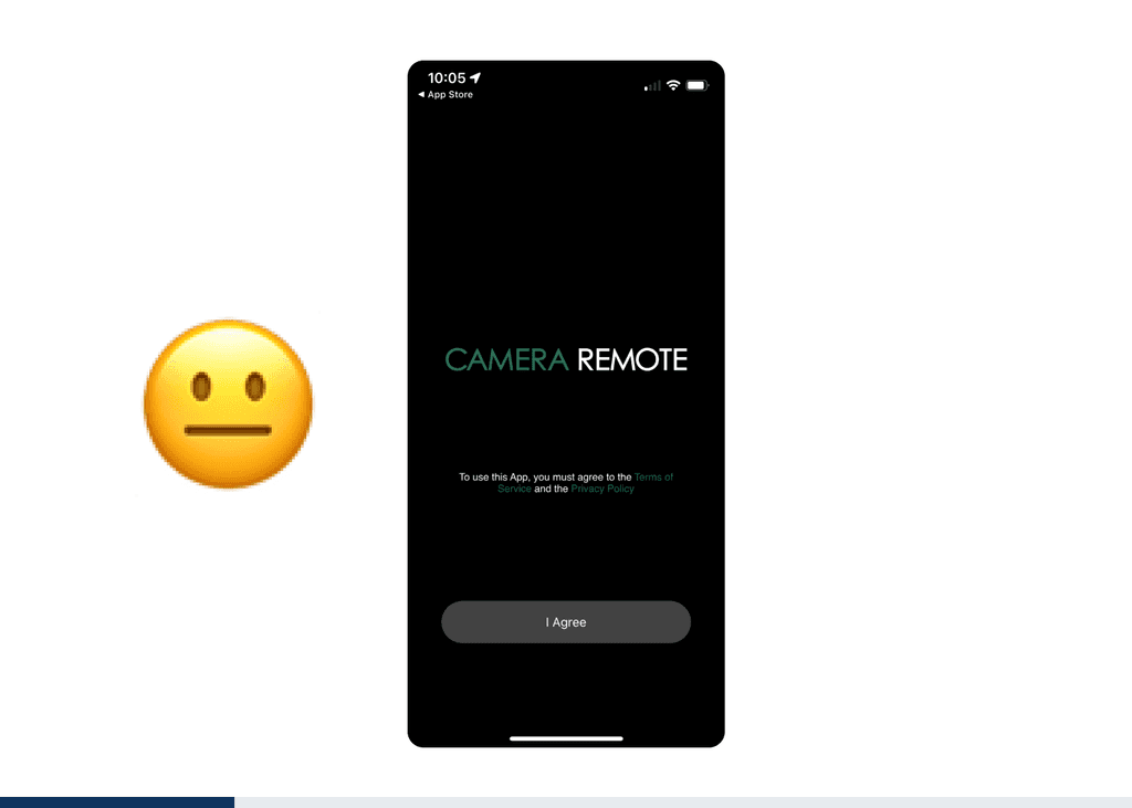
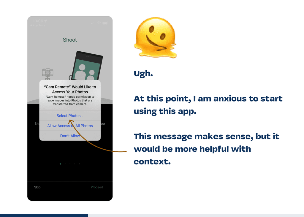
When we got back I was ready to transfer all my photos and share my trip with my friends and family. I downloaded the Fujifilm app and was met with a truly awful experience.
Let’s walk through it 👇


Three Experiences Redesigned
Unfortunately, we’ve all used apps or websites that drive us crazy.
Most people are not going to take the extra step to transfer photos from a camera to their phone, iPhone photography is just too convenient. I believe if Fujifilm wants to reach a broader audience, they need to remove friction from the transfer experience and make it fun.
Vintage charm can't entirely cover up a frustrating experience. Let's see how the app experience could catch up to the camera experience.
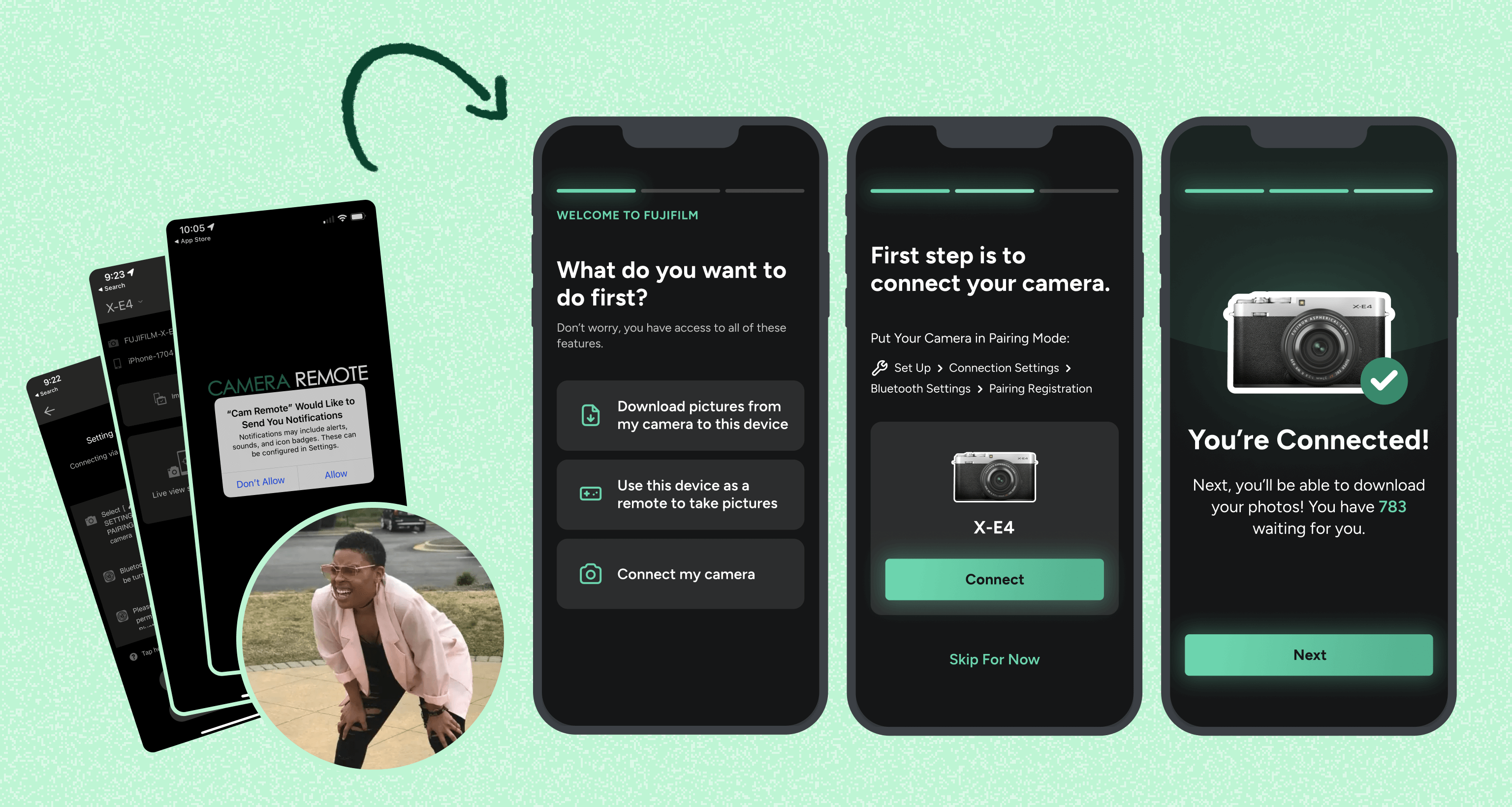
Help the User Do What They Want First
I would hazard a guess that most users are coming in to download their photos (like me). Instead of helping new users do that right away, they have to trudge through a plethora of screens that don’t apply to them. Yikes.
Here's how I would kick off onboarding. 👇

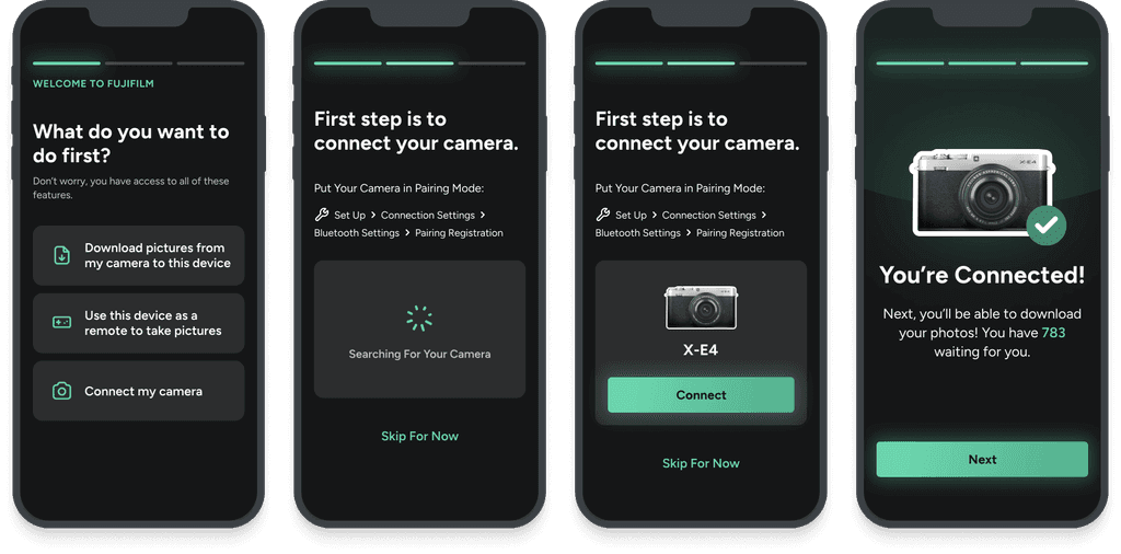
Simplify Connecting The Camera
Oftentimes in product design, the simplest solution wins. What would it look like to connect the user’s camera in as few steps as possible?
If you help someone solve a problem quickly, they will come to you next time they need help. Here's how that might look.

Celebrate Little Wins
I’m all about being clear over clever when it comes to digital products, but this app is as dry as it gets. It’s unbranded. It doesn’t even use the same font as Fujifilm’s website. There is no transfer of trust.
There was nothing unique or compelling about this app. Fujifilm has a great brand and I wanted an app experience that felt like using their camera. I wanted it to feel sturdy, professional, and artistic. Instead, it felt brittle, clunky, and sterile.
What would it look like to celebrate an exciting moment with the user?

This is an example of behavioral delight, a nice big checkmark letting you know a task is complete (see how easy it was?). Things like make it easier for someone to recommend this product to a friend.
Reduce Friction and Impact Emotions
One of the not-so-top-secret secrets of user experience design is to talk to people like they are humans. Pretend this experience was a store front and a new customer just walked in. How would you treat them?
What would you say to them first? What do you want them to feel?
If I was working on this project, my next steps would be to explore additional solutions and then test them with real users. There are plenty of other problems with this app, but that's all for this case study!
Dear Fujifijlm, please let me bulk transfer photos next time because those are hours of my life that I can't get back 😬

Original UX case study researched, written, designed, and built by me, Jack Hawkins.
