UX Case Study
Real Work
Revamping the Experience and Usability of America's #1 Personal Finance Class
🔥 Results
42%
Decrease in customer support tickets year over year.
41%
Finish rate for Financial Peace University. (3x the industry average)
My Most Fruitful Season as a Senior Product Designer Yet 🍎
I'll be honest – I did not want to join this team at first. But, growth is always on the other side of some pain. 💪
I had just moved teams twice in a month due to leadership changes. I was happy where I was and made it clear that I didn't want to move teams... again.
They explained they needed someone experienced to tackle some ambiguous work on our flagship course, Financial Peace University. Don't get me wrong, FPU is incredible. It just wasn't what I envisioned myself working on at that moment.
I disagreed on the team change, but committed to do the work in front of me. It ended up being a wildly productive season with unforgettable friends.
4 Months with the Largest (and Fastest) Engineering Team I've Ever Worked With
With this team change, they combined 2 different engineering teams. Our work output was insanely high, which put a level of urgency on my work that actually helped me push past analysis paralysis. We balanced objective-based work with enhancements to the overall experience.
We got a lot done in 4 short months. We essentially overhauled two web applications, and the best part? It was really fun.
Several factors contributed to this successful season:
A healthy supply of experienced full stack engineers hungry for work (This lit the 🔥fire🔥 of urgency under me)
Leaders who trusted our judgment
My confidence in expressing our brand through the interface
Minimal unnecessary meetings, which reduced overthinking
A habit of regularly addressing UX Debt
Frequent chats with sales and customer success
Delivering positive visual changes to the products at a fast pace kept morale high with the whole team.
The Wisdom of the Customer Success Team
As a product designer, my favorite meeting each week was with customer success. They were able to specifically tell us which parts of our product needed the most help.
Once we understood the problem and how it connected to our annual objectives, we could start creatively solving them. It was an invaluable feedback loop.
Now, here is the work 👇
Financial Peace University Redesign
Here's a sampling of the work I did! These static screens don't fully represent all of the high detail work that goes into all of the interactions.
Home

The first impression and jumping off point of FPU. I wanted to keep give it clear hierarchy.
🧐
Want to see what it looked like before the redesign? Check out a few of the screens here.
Lessons & Activities

One of my favorite design updates. This page was so boring before. We combined the activities with the lessons to encourage high completion rates of valuable actions.
Lesson Page Locked

If the user has not purchased the course, this is what they would see.
Lesson Page

Simple, clear, usable video page.
Achievements

Big visual upgrade here. I collaborated with designers across the company and then created all of these design assets.
Certificate

Believe it or not, the certificate is a huge deal to users. This new design fixed usability issues and made it more fun to complete the course.
Feedback

With a few key changes, we significantly increased the rate of positive feedback. This feedback is used in a variety of ways to market the product.
Find a Class

I wanted picking a class to feel personal and exciting, so I implemented a ripped paper motif. And yeah, I'm a fan of the show The Bear.
Resources

I love using illustrations to make a page more scannable and fun.
Administrator View Redesign
Organizations can purchase Financial Peace University for their team. Here is their revamped experience.
Home

Here's the jumping off point for administrators who are managing Financial Peace University in their organization.
Quick Start Checklist

In an effort to get new clients to take key actions, we created this simple checklist component. The conclusion of this list is that someone at their organization is actually sent access to FPU.
My Classes
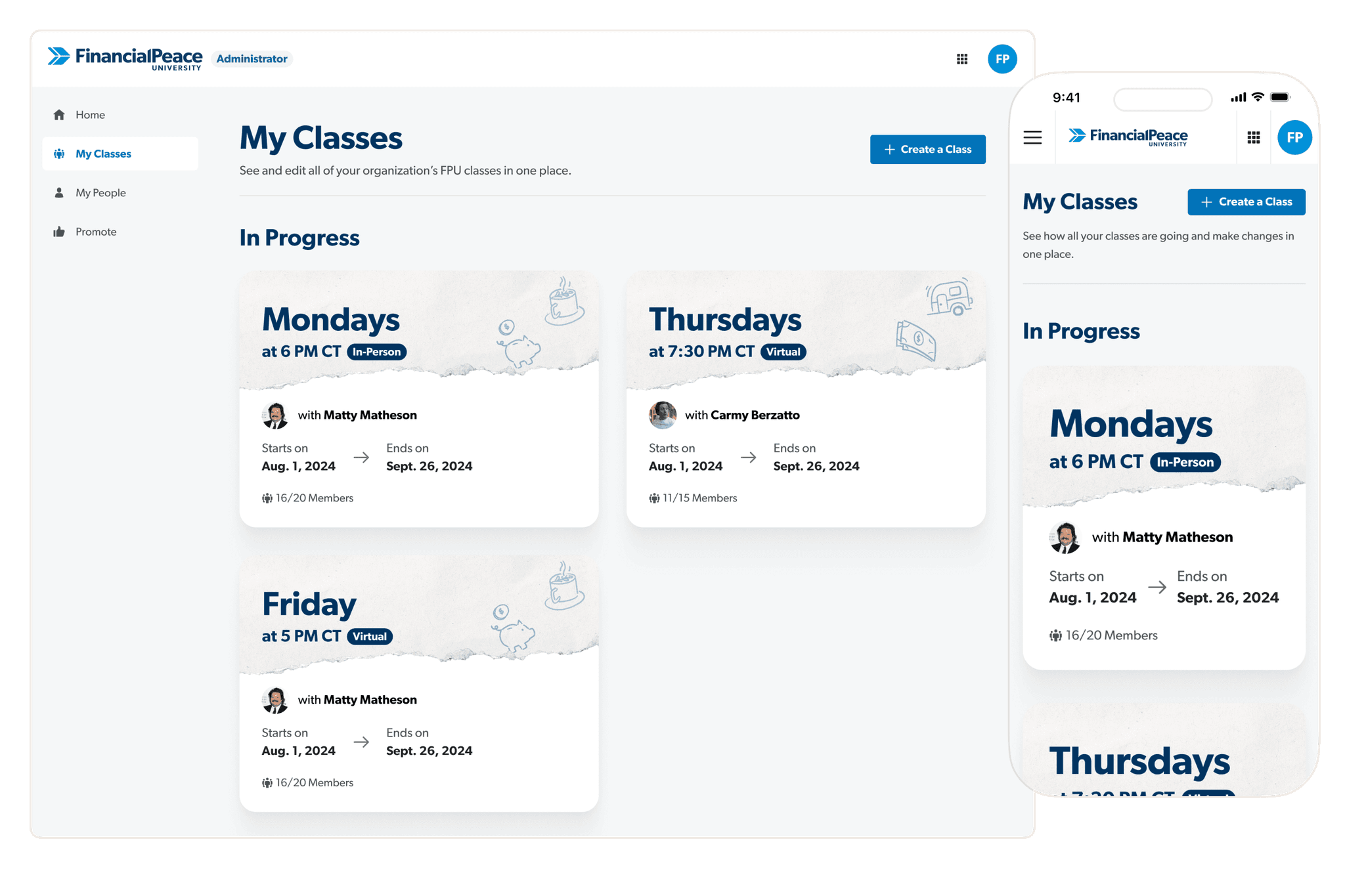
The class cards before were super boring. I wanted to breathe new life into them with ripped paper and illustrations.
My People
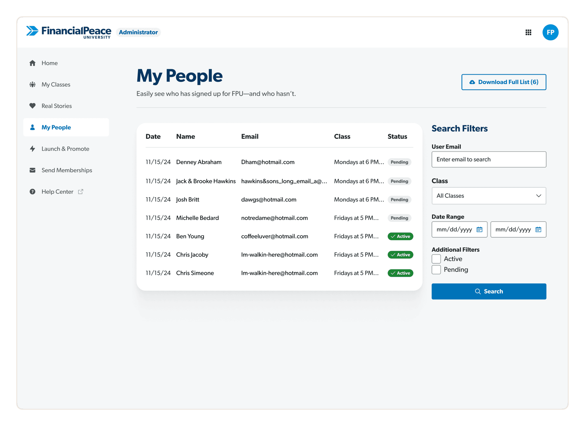
We made a few easy usability changes to page that seriously cut down on confusion.
Launch & Promote

This was a brand new page that we put together based on a clear user problem we had around launching classes.
Real Stories
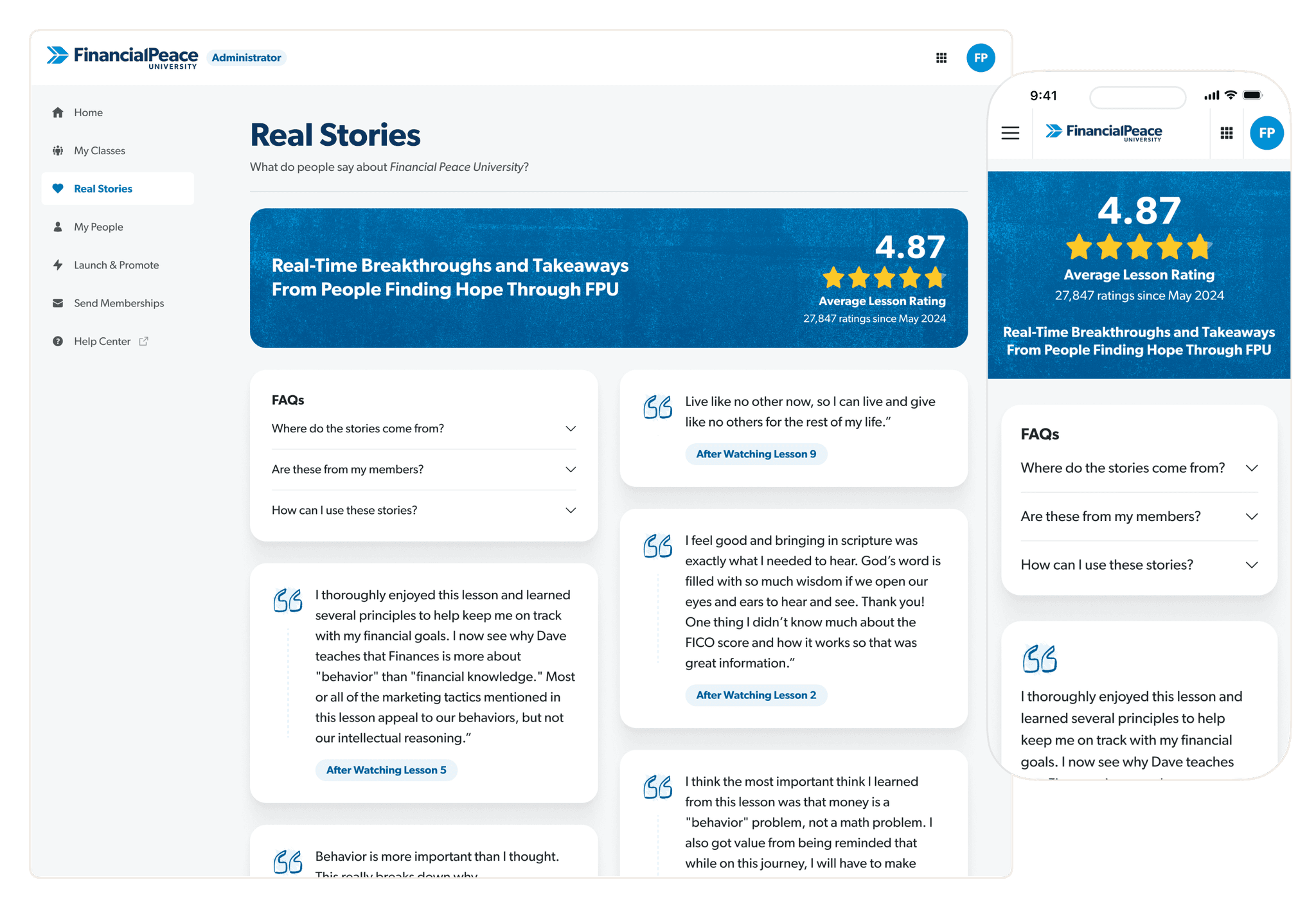
We found out that organizations typically care more about personal stories from their people over financial turnaround numbers. This page was our first test around surfacing those stories to see how it impacts retention.
Initial Financial Snapshot

In order to prove out the worth of the program, we capture positive financial progress as the user goes through the course. We made it way easier for a new member to put in their numbers.
The Next Chapter 📖
My time working on Financial Peace University came to a close and I walked away very proud of the work my team accomplished. 🎉
In this next season, I will be focused on the world class budgeting app, EveryDollar. This is a natural progression from Financial Peace University because it's all about putting your knowledge into action with your monthly spending.
If you have any questions, ideas, or just want to see how I organize my figma files, don't be a stranger.
To Wrap It Up
→
Get your team in the habit of fixing UX Debt. Seeing positive visual changes to the app each week made work a ton of fun.
→
Listen to your customer success team.. Also listen to your gut. Create a balance of solving known user problems and making the app more enjoyable to use.
→
Stretch yourself & grow. You don't always know what you need until you look back later.

Original UX case study researched, written, designed, and built by me, Jack Hawkins.
